Best Practices for Creating Patient-Centric Medical Websites
Most people don’t land on a medical website in a good place. They’ve Googled symptoms they don’t fully understand. They’ve bounced from one appointment to another with no clear answers. They’re tired. They’re frustrated. And they’re running low on hope.
In that moment, your website isn’t just a digital brochure—it’s a lifeline.
Too many practices still treat their site like a checklist: logo, phone number, stock photos, a few blurbs about treatments. But patients don’t care about flashy animations or clever taglines. They care about whether you see them, hear them, and can help them find relief when no one else has.
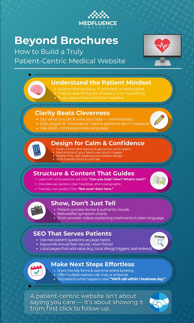
Creating a patient-centric website means shifting the focus. It’s not about saying “we’re the best”—it’s about showing someone that they’ve finally found the right place. That shift doesn’t require a complete brand overhaul. It starts with intention: how your site looks, what it says, and how it makes someone feel the moment they land on it.
Understanding the Patient Mindset
When someone visits a medical website, they’re often in a vulnerable state—mentally, physically, or both. They’re not window shopping. They’re looking for relief. That context should guide everything about how a practice presents itself online.
Many patients have already seen multiple doctors. They’ve tried treatments that didn’t work. They’re not just looking for a provider; they’re hoping for someone who won’t brush them off. That’s why trust has to be built from the very first headline.
Clarity over cleverness
This is where many medical websites lose people. Practices sometimes get so focused on sounding “innovative” or “high-tech” that they bury what matters most: what they do, who they help, and how to take the next step. Clever branding and buzzwords don’t resonate with someone who’s just trying to understand whether your team can help with their pain, fatigue, or brain fog.
Marketing to patients vs. building for them
Patients aren’t leads. They’re people. And most of them are too overwhelmed to sift through a jargon-filled homepage to figure out if you’re a match. Building a site for patients means designing every word, button, and visual with their experience in mind—not just your practice’s goals.
Frustration is everywhere
The average medical website still suffers from the same problems:
- Menus with 15+ options and no clear path
- Walls of text that try to impress instead of explain
- Calls-to-action that are too aggressive, too vague, or both
- Generic promises that sound like every other clinic
A patient-centric website skips the noise. It gives real people what they’re looking for: hope, clarity, and a sense that they’re finally not alone in what they’re going through.
Clear, Purpose-Driven Design
Design is more than decoration. It’s how your site communicates before a single word is read.
If your design overwhelms, confuses, or frustrates users—even slightly—they will leave. Period. Attention spans are short, mobile users are impatient, and no one wants to dig through clutter to figure out what you actually do.
Minimalism wins
Less truly is more. Clean layouts with generous white space, clear headings, and logical flow help patients feel calm and in control. Avoid trying to squeeze too much onto one screen. One idea per section. One next step per page. Give people breathing room to absorb what you’re offering.
Design for mobile first
Over half of healthcare website visits come from mobile devices. If your site looks great on desktop but breaks down on a phone, you’re losing people before they even see what you offer. Mobile-first design doesn’t just mean responsiveness—it means making sure buttons are tappable, fonts are readable, and load times are fast even on slow connections.
Speed, accessibility, and inclusivity
Patients with chronic illness, cognitive overload, or disabilities aren’t a niche—they’re your users. Your site should work for everyone. That means:
- Fast page load times (ideally under 3 seconds)
- ADA-compliant contrast ratios and font sizes
- Screen reader-friendly layouts
- No flashing elements or confusing motion
If your website feels easy to use for everyone, that’s a win.
Use real visuals—or none at all
Stock photos are a dead giveaway. Patients can tell when a site is using a generic image of “happy couple walking on beach” or “doctor with clipboard smiling at camera.” These don’t build trust—they build distance. Use real photos of your space, your team, or none at all. Authenticity beats perfection every time.
The Right Information in the Right Order
The most common reason patients bounce off a medical website? They can’t find what they’re looking for—and they don’t have the time or energy to figure it out.
If your site makes patients dig through menus, scroll endlessly, or click into every subpage just to understand what you treat and how to book, you’re creating friction. And friction kills conversions.
Lead with what matters
Start with what patients are most likely wondering:
- Can you help with my condition?
- What makes your approach different?
- How soon can I get in, and what will it cost me?
Your homepage should give a fast, clear answer to those questions—above the fold. Don’t bury the good stuff under fluffy intros or stock mission statements.
Clear, non-pushy calls-to-action
Your call-to-action (CTA) shouldn’t read like a hard sell. It should feel like a helpful next step:
- “Not sure if we treat your symptoms? Start here.”
- “Get your questions answered in a free phone consult.”
- “See real stories from people like you.”
Use plain, warm language that anticipates patient hesitation. “Book now” isn’t wrong, but it’s not always enough.
Be up front with details
If you offer cash-pay options, say so. If you don’t take certain insurances, be clear. Patients don’t want to waste time figuring out the logistics—they’ll move on to a provider who tells them up front what to expect.
And while listing prices can be tricky in healthcare, even a rough range or a “starting at” can lower anxiety and boost trust.
Don’t just tell—show
Adding social proof doesn’t mean pasting in five-star reviews. It means showing your impact:
- Patient success stories (ideally specific and condition-focused)
- Before/after symptom charts or outcomes
- Brief video clips of providers explaining procedures or results in plain terms
People want to see that you’ve helped others in their situation. Don’t just say “We care.” Prove it.
SEO Without Selling Out the User Experience
Search engine optimization is necessary—but not at the cost of making your site feel like an AI-generated word salad. You don’t have to choose between ranking on Google and creating a smooth, human experience. In fact, the two go hand in hand when done right.
Write for people first
If your copy is stuffed with “sinus treatment San Antonio best ENT doctor sinusitis relief near me”—you’ve already lost the patient. The content might rank, but once a real person lands on it, they’ll bounce. Google notices that too.
What works better:
- Clear, conversational headings
- Pages built around real questions (“Why does my nose keep bleeding?” “When is sinus surgery necessary?”)
- Simple, honest answers in language your patients actually use
Use keywords naturally, not robotically. Don’t try to be clever—be useful.
Structure matters
Use H1s and H2s that mirror how a real person would read the page. Chunk content into digestible sections with clear subheadings, bullets, and short paragraphs. Google loves structure. So do humans.
If your blog posts read like 8th-grade science textbooks, they’re too dense. If they read like Facebook captions, they’re too thin. Aim for balance—clear, confident, and easy to follow.
FAQs that actually help
Many practices toss a token “Frequently Asked Questions” section at the bottom of a page. But when done right, this can be SEO gold.
Use real questions your front desk or intake team hears daily. Write answers in plain language. Bonus: Mark them up with schema so they qualify for rich snippets in search results.
Location content without the cringe
Yes, location pages matter—but make sure they add value. Instead of spinning the same generic content for every city you serve, try this:
- Mention nearby hospitals, schools, or known areas
- Include patient reviews from that location
- Address any regional-specific issues (e.g. allergy season in Louisiana)
You can serve Google and still respect your readers’ time. That’s how you build trust and get found.
Messaging That Reflects How You Actually Help
Here’s the truth: most medical websites sound exactly the same. “Compassionate care.” “Personalized treatment.” “State-of-the-art facility.” These phrases might check a box—but they don’t tell patients anything meaningful.
If you want your site to connect, you need to speak to real concerns in real language.
Ditch the jargon
Patients don’t think in ICD codes or procedure names. They’re not Googling “Functional Endoscopic Sinus Surgery.” They’re typing things like:
- “Why do I always feel congested?”
- “Can allergies cause brain fog?”
- “How do I know if I have a deviated septum?”
Use that. Build pages around how people describe their symptoms—not how you categorize them. This doesn’t mean dumbing things down. It means writing like someone who wants to be understood.
Lead with outcomes, not processes
Patients aren’t impressed by how advanced your tools are if they don’t understand what those tools will do for them. Instead of fixating on the treatment itself, focus on the result:
- “Sleep through the night without waking up congested.”
- “Breathe easily during your workouts again.”
- “Cut down your use of allergy meds—without guessing.”
If you absolutely need to explain a procedure, use plain language and tie it directly to a benefit. “We use a small balloon to gently open blocked sinuses so you can breathe better in just one visit.” That’s a line people remember.
Address objections without being defensive
Anticipate what’s holding someone back and speak to it directly:
- “Tried nasal sprays with no success? You’re not alone.”
- “Worried sinus surgery will be painful? Here’s what most patients say about recovery.”
- “Not sure if this is covered by insurance? We’ll walk you through it.”
Acknowledging concerns shows confidence—not weakness.
Don’t rely on buzzwords
“Innovative.” “Cutting-edge.” “Comprehensive.” All of these are filler unless you explain why it matters. Instead of “innovative treatments,” say, “Treatments designed for long-term relief—not just symptom control.”
Say something real. That’s how patients decide if they trust you.
Forms, Booking, and Next Steps
If someone’s made it through your homepage, clicked around your condition pages, and is still reading—they’re interested. But a surprising number of medical websites fumble here by making the next step too confusing, too aggressive, or too buried.
Here’s how to fix that.
Keep forms short and focused
Nobody wants to fill out a 12-field form just to request a callback. Your initial form should feel easy:
- First name
- Phone or email
- What they’re contacting you about (dropdown is fine)
- Optional: “Tell us a little about what’s going on”
That’s it. You can always gather more details later. Right now, the goal is to reduce hesitation, not screen people out.
Offer multiple ways to act
Different people have different comfort levels. Some want to book instantly. Others just want to ask a question. Offer both:
- “Request a call”
- “Ask a question”
- “Book online now”
This helps capture more people without forcing everyone down the same funnel.
Online scheduling isn’t optional anymore
If your site still asks people to call during office hours to book…you’re leaving money on the table. Patients are busy. They want to book at 9:30 PM from their couch—not wait on hold tomorrow morning.
Use a real-time booking tool that shows availability and confirms appointments instantly. If you can’t do that yet, at least offer a fast-response promise (“We’ll confirm your request within 1 business day”).
Set clear expectations
Tell people what happens after they click “submit.” Example:
“Thanks! A care coordinator will call you within 24 hours to help you schedule or answer your questions.”
This small touch lowers anxiety and makes your practice feel more human. Which, again, is what patients are looking for.
Avoid pressure—but don’t be passive
You don’t need to scream “BOOK NOW!” at the end of every page. But you also shouldn’t leave people wondering what to do next. Every page should lead somewhere:
- “Still have questions? Talk to a real person.”
- “Think this might be a fit? Let’s find out together.”
- “Ready to get started? Choose your time.”
Make the path forward obvious and inviting. Not pushy. Not vague. Just helpful.
The Follow-Up Experience: Email, Retargeting, and Beyond
Most patients don’t book on the first visit. They get distracted. They overthink. They close the tab and forget where they were. That’s normal. But if your follow-up game is weak—or nonexistent—you’re relying on hope instead of a system.
The goal isn’t to pester people. It’s to stay on their radar in a way that feels supportive, not salesy.
Start with helpful email
If you’re collecting email addresses (via forms, lead magnets, or downloads), don’t waste the opportunity by sending generic newsletters. Send value:
- “5 Things That Might Be Causing Your Chronic Fatigue”
- “How to Know if It’s Allergies or Something More Serious”
- “Why Some Sinus Infections Never Fully Go Away”
Keep it short. One idea per email. Use plain language, and always include a no-pressure CTA like, “Want to talk about your symptoms? Schedule a free call.”
Use retargeting (the right way)
Ever browse for shoes and get followed around the internet for days? That’s retargeting. And when done well, it works.
For healthcare, keep it gentle:
- Show ads for educational blog posts or patient stories—not just appointment booking.
- Remind people what you treat in simple terms: “Still struggling with sinus pain?” “Brain fog that just won’t quit?”
The goal is to jog their memory and help them feel seen—not bombard them into submission.
Create a patient education loop
Think beyond “contact us.” Use your site and emails to help people understand their symptoms better, recognize when it’s time to seek care, and feel less alone in their experience.
That might look like:
- A quiz: “Is It Time to See a Doctor About This?”
- A series: “Understanding Chronic Sinus Issues in 3 Easy Emails”
- A guide: “What to Expect at Your First Visit”
These aren’t gimmicks. They’re lifelines for people stuck in uncertainty.
Track and adjust
Use basic analytics to see what’s working:
- What pages do people spend time on?
- Where do they drop off?
- Which email subject lines get opened?
This isn’t about chasing metrics. It’s about understanding patient behavior so you can meet them where they are—and help them move forward.
Why This Isn’t Optional Anymore
A patient-centric website isn’t a nice-to-have. It’s the front door to your practice—and in many cases, your only shot at earning someone’s trust.
It doesn’t matter how talented your team is or how advanced your treatments are. If your site feels cold, confusing, or outdated, patients will assume your care is too. That may not be fair, but it’s reality.
You don’t need a flashy redesign or a marketing agency that speaks in buzzwords. You need a website that tells the truth clearly, makes people feel heard, and gives them a low-pressure path to take the next step. That’s it.
The practices winning right now aren’t doing more—they’re doing less, but better:
- Fewer distractions, more clarity
- Fewer clicks, more connection
- Fewer assumptions, more answers
In a world where patients feel ignored, overwhelmed, or misdiagnosed, a truly patient-centered website doesn’t just convert better—it makes people feel seen. And that’s what earns trust. At Medfluence Advisors, we help practices build websites and messaging that reflect the care they actually deliver—and connect with the patients who need them most.
Accurate marketing attribution is the cornerstone of successful digital marketing — especially in healthcare. With increasing competition and…

Worried your marketing might bring in more than your team can handle—or worse, the wrong kind of leads? That’s not a growth plan—it’s a…