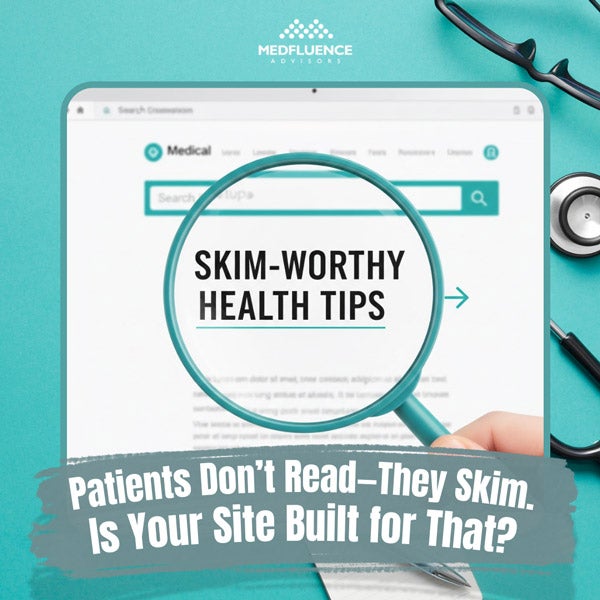
Patients Don’t Read—They Skim. Is Your Site Built for That?
Picture this: A parent with a sick child pulls up your medical practice’s website at 11 PM. Their eyes are tired, they’re worried, and they need answers fast. Do they sit down and carefully read every word on your homepage? Not a chance.
They skim. They scan. They hunt for the information they need and bounce if they can’t find it in seconds.
Here’s the reality check most medical practices need: The average person reads only 20-28% of the words on a web page. That means your carefully crafted paragraphs about your state-of-the-art equipment? Most patients are scrolling right past them.
But here’s the good news: Once you understand how patients read online, you can design your website to work with their natural scanning patterns instead of against them. Let’s break down exactly how to do that.
Why Patients Skim (And Why That’s Actually Smart)
Before we dive into solutions, let’s understand the problem. Patients aren’t skimming because they’re lazy or don’t care about their health. They’re skimming because:
- They’re often in pain or stressed. Nobody browses medical websites leisurely. They’re looking for solutions to real problems, often urgently.
- They’re overwhelmed with information. The average healthcare website throws dozens of services, doctor bios, insurance details, and medical terms at visitors all at once.
- They’re on their phones. Over 60% of healthcare searches now happen on mobile devices, where reading long paragraphs feels like a chore.
- They have specific questions. They’re not here to learn about your practice’s history since 1987. They want to know: Can you help me? Do you take my insurance? Where are you located?
Understanding this mindset shift changes everything about how you should build your site.
The F-Pattern: How Eyes Actually Move on Your Page
Research using eye-tracking technology has revealed something fascinating: When people scan web pages, their eyes follow a consistent F-shaped pattern.
Here’s how it works:
- First, eyes move horizontally across the top of the content area (the top bar of the F)
- Then they scan down the left side of the page looking for interesting starting points
- Occasionally, they scan right again when something catches their attention (the second bar of the F)
What does this mean for your medical website? The most important information needs to live in the top-left area of your page, in your headlines, and at the beginning of your paragraphs.
Burying your phone number at the bottom of a page? That’s working against how human eyes naturally scan. Putting insurance information in the middle of a long paragraph? Most patients will never see it.
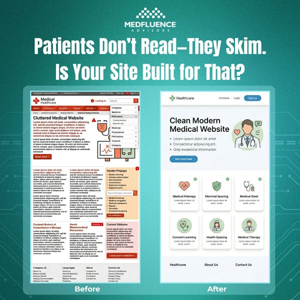
Building Blocks of a Skimmable Medical Website
Let’s get practical. Here are the specific elements that transform a text-heavy website into a scannable, patient-friendly resource.
1. Headers That Actually Help
Headers aren’t just for making text look pretty. They’re signposts that guide skimming eyes to the right information.
Bad header example: “Our Approach”
Better header example: “Same-Day Appointments Available – Here’s How to Book”
See the difference? The second header tells patients exactly what they’ll learn and includes a benefit. It answers the question “What’s in this for me?” immediately.
Header rules for medical websites:
- Use headers every 2-3 paragraphs (no giant walls of text)
- Include keywords patients actually search for (“urgent care,” “accepting new patients,” “insurance accepted”)
- Make headers specific, not vague
- Use question-based headers when possible (“Do You Take My Insurance?” “What Should I Bring to My First Visit?”)
2. Visual Hierarchy: Making the Important Stuff Obvious
Visual hierarchy is a fancy term for a simple idea: More important information should look more important.
On your medical website, this means:
- Size matters. Your phone number should be bigger than your fax number. Your “Book Appointment” button should be more prominent than your “Meet Our Team” link.
- Color creates contrast. Important actions (like appointment booking) should stand out with different colors. Don’t make everything blue – patients won’t know what to click first.
- White space is your friend. Cramming information together makes everything harder to scan. Give your content room to breathe. Generous spacing between sections helps eyes find stopping points.
- Bold and bullets work. When you need patients to remember specific instructions (like “fast for 12 hours before your blood draw”), make that text bold. Turn lists into actual bullet points instead of hiding them in sentences.
3. Microcopy: The Tiny Words That Make a Big Difference
Microcopy is the small bits of text throughout your site – button labels, form instructions, error messages, and little helper notes. These tiny words have huge impact.
Bad microcopy examples:
- Button: “Submit”
- Form instruction: “Required field”
- Error message: “Invalid input”
Better microcopy examples:
- Button: “Book My Appointment”
- Form instruction: “We’ll call you at this number to confirm”
- Error message: “Please enter your phone number with area code”
Notice how the better examples are more specific and more human? Good microcopy:
- Uses “you” and “your” instead of “the patient” or “our practice”
- Explains why you’re asking for information (“We need your insurance info to verify coverage before your visit”)
- Reduces anxiety by setting expectations (“You’ll hear from us within 24 hours”)
- Uses active voice (“Schedule your checkup” instead of “Checkups can be scheduled”)
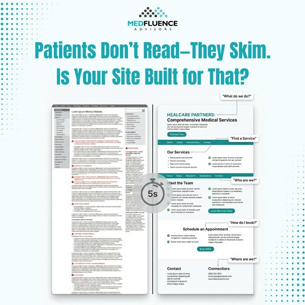
4. The Five-Second Test
Here’s a quick way to check if your website is truly skimmable: Can a stranger understand your main message in five seconds?
Show your homepage to someone unfamiliar with your practice. After exactly five seconds, take it away and ask:
- What does this practice do?
- What action were they supposed to take?
- What makes this practice different?
If they can’t answer these questions, your site isn’t scannable enough. The solution? Lead with clarity:
- Put your core message front and center: “Family Medicine in Downtown Portland – Accepting New Patients”
- Make your main action unmissable: A bright “Book Appointment” button in the top-right corner of every page
- Highlight what makes you different: “Evening & Weekend Hours Available” right under your practice name
5. Mobile-First Is Patient-First
Remember: Most of your patients are visiting on phones while they’re waiting somewhere, researching in bed, or even sitting in another doctor’s waiting room.
Mobile-friendly doesn’t just mean “works on small screens.” It means:
- Thumb-friendly buttons. Make clickable elements big enough to tap easily – at least 44 pixels tall. Nobody wants to zoom in to hit a tiny “Request Appointment” link.
- Front-loaded sentences. Mobile screens are narrow. Put the important words first: “Accepting new patients starting June 2024” instead of “Starting June 2024, we’re happy to announce we’re accepting new patients.”
- Collapsible sections. Use dropdown menus or expandable sections for detailed information. This lets patients choose what they want to read without scrolling through everything.
- Click-to-call phone numbers. Every phone number should be tappable. Don’t make patients copy and paste or memorize your number.
6. The Power of Formatting Choices
Little formatting decisions add up to big differences in readability.
- Paragraph length: Keep paragraphs to 3-4 sentences maximum. On mobile, even two sentences might be enough for one paragraph.
- Sentence length: Aim for 15-20 words per sentence on average. Mix shorter and longer sentences for natural rhythm.
- Font choices: Sans-serif fonts (like Arial or Helvetica) are easier to read on screens than serif fonts (like Times New Roman). Font size should be at least 16 pixels for body text.
- Contrast: Black text on white background is easiest to read. If you use colored backgrounds, make sure there’s strong contrast with your text color.
Content Organization: The “Inverted Pyramid” Approach
Journalists have used this technique for over 100 years, and it works perfectly for medical websites too.
The inverted pyramid means: Most important information first, details later.
- Traditional approach: “Founded in 1995, our practice has grown to include five providers who specialize in various aspects of family medicine. We’re located in the historic downtown district and offer a full range of services. You can schedule appointments by calling our office.”
- Inverted pyramid approach: “Call (555) 123-4567 to schedule your appointment. We’re a family medicine practice in downtown Springfield with five providers, offering same-day sick visits and accepting most major insurance plans.”
See how the second version leads with action? Patients who need an appointment can stop reading after the first sentence. Those who want more details can keep going.
Apply this to every page on your site:
- Services pages: Lead with what you treat and how to book, then add details about approaches and philosophies
- Insurance pages: Start with a simple list of accepted plans, then explain the verification process
- Provider bios: Begin with credentials and specialties, then share personal interests
Creating Scannable Pages: A Practical Checklist
Let’s put this all together with a simple before-and-after example.
BEFORE (not skimmable)
About Our Pediatric Practice
Welcome to X Pediatrics. We are a comprehensive pediatric practice that has been serving the families of Riverside County since 2010. Our team consists of three board-certified pediatricians and two nurse practitioners who are all dedicated to providing the highest quality care to children from birth through adolescence. We offer well-child visits, sick visits, immunizations, and developmental screenings. Our office is open Monday through Friday from 8 AM to 5 PM, and we also have Saturday morning hours available. We accept most major insurance plans and are currently accepting new patients. To schedule an appointment, please call our office or use our online patient portal.
AFTER (highly skimmable)
Pediatric Care in Riverside – Now Accepting New Patients
Call (555) 789-0123 or Book Online
We’re here for your child from birth through teenage years:
- Well-child checkups
- Sick visits (often same-day)
- Immunizations & school physicals
- Developmental screenings
Office Hours:
Monday–Friday: 8 AM – 5 PM
Saturday: 8 AM – 12 PM
Insurance: We accept most major plans including Blue Cross, Aetna, UnitedHealthcare, and Medicaid. See full list.
Our team: 3 board-certified pediatricians + 2 pediatric nurse practitioners with over 40 years combined experience.
The “after” version contains the same information but organizes it for skimming eyes. Notice:
- Lead with the action (call or book)
- Use bullets for lists
- Add icons or bold labels for key sections
- Break information into labeled chunks
- Put hours in an easy-to-scan format
Common Mistakes That Kill Scannability
Even well-meaning practices make these errors:
Mistake #1: Burying contact information. Your phone number and “Book Appointment” button should appear on every single page, ideally in the same spot (top-right corner works well).
Mistake #2: Using medical jargon. Phrases like “comprehensive primary care services” mean less than “we treat colds, manage diabetes, and do annual physicals.” Write like you’re talking to your neighbor, not presenting at a medical conference.
Mistake #3: Making patients hunt for basics. Location, hours, insurance info, and services shouldn’t require clicking through multiple pages. Put them on your homepage.
Mistake #4: Automatic video or music. Nothing makes people hit “back” faster than unexpected sound. If you use video, make it click-to-play.
Mistake #5: Long forms with no explanation. If your new patient form has 30 fields, tell people upfront: “This takes about 5 minutes to complete and saves time at your first visit.”
Testing Your Site’s Scannability
Want to know if your current site works for skimming patients? Try these tests:
- The blur test: Squint at your homepage until the text is blurry. Can you still tell which sections are which? Do the important elements stand out? If everything looks the same when blurred, you need stronger visual hierarchy.
- The scroll test: How far down do patients need to scroll to find your phone number? Your hours? How to book? The answer should be: “They don’t need to scroll at all.”
- The real person test: Ask five people outside of healthcare to visit your site and complete a task: “Find out if they take your insurance” or “Book an appointment for next Tuesday.” Watch where they click. If they get confused or frustrated, that’s valuable feedback.
Your Free Scannability Toolkit
To help you put these principles into action, we’ve created a free Website Scannability Checklist you can download and use today.
This one-page PDF includes:
✅ 15-point checklist to audit your current site
✅ Before-and-after examples for common medical website pages
✅ Mobile-friendly checklist
✅ Readability score calculator instructions
Plus, we recommend these free tools:
- Hemingway Editor (hemingwayapp.com) – Paste your website copy to check reading level. Aim for grade 6-8 for patient-facing content.
- WebAIM Contrast Checker (webaim.org/resources/contrastchecker/) – Make sure your text colors meet accessibility standards.
- Google’s Mobile-Friendly Test (search.google.com/test/mobile-friendly) – See how your site performs on phones.
Download Your Free Scannability Checklist Here – PDF
Respect Your Patients’ Time
Here’s what it all comes down to: When you make your website easy to skim, you’re showing patients you respect their time and understand their needs.
You’re acknowledging that they’re busy, possibly stressed, and looking for specific answers. You’re meeting them where they are instead of expecting them to work hard to understand you.
The practices that get this right see real results:
- More appointment bookings
- Fewer “Where are you located?” phone calls
- Better patient satisfaction scores
- Higher website engagement
Most importantly, you’re removing barriers between patients and the care they need. When someone can quickly find your hours, verify you take their insurance, and book an appointment—all from their phone while standing in line at the grocery store—that’s a win for everyone.
Your Next Steps
Ready to make your website more skimmable? Start here:
- Pick one page to improve this week. Your homepage is a great starting point.
- Apply the five-second test. Show it to someone and see if they get the main message immediately.
- Add headers every 2-3 paragraphs. Make sure each header tells readers what they’ll learn.
- Put your phone number and “book appointment” button at the top of every page. Make them impossible to miss.
- Download the checklist and work through it section by section.
Remember, you don’t have to redesign your entire website overnight. Small improvements add up. Each header you add, each paragraph you break up, each bullet list you create—it all makes your site a little more patient-friendly.
Because at the end of the day, your website isn’t about showcasing your practice. It’s about helping patients get the care they need with as little friction as possible.
And that starts with understanding one simple truth: Patients don’t read. They skim. And now your site is built for exactly that.
Do you need help transforming your medical practice’s digital presence? Medfluence Advisors specializes in creating patient-centered healthcare websites that actually convert visitors into appointments. From scannable layouts to strategic content, we help practices like yours stand out online and grow their patient base. Give us a call today!
A Single Word Can Change Patient Action
A patient stares at a colonoscopy prep form, unsure whether to click the button labeled “Submit.” The…

Organic reach is a very powerful tool for businesses’ growth and success, including those in the healthcare industry. A well-crafted and smart social…